Lately, I have been in touched with graphic design rather than crafting. Which brought me to my very first art exhibition called Art Attack2. Organised by the talented Davao Graphic Designers Community.
Since it’s my first time to join one, the dilemma was… I have never tried making an art for my own sake before plus l have mastered the art of procrastination {which I’m definitely not proud of}, thus equates to total panic mode.
In my mind, I know what kind of artwork I want to make. I am greatly inspired by Kate Forrester {first photo} and Katie Daisy’s {2nd photo} illustrations both digital and traditional, so they were my pegs.
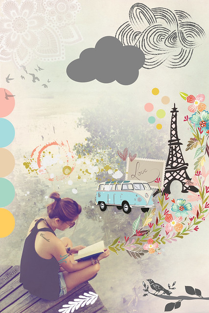
Let me share my process… few days before the event, I still couldn’t figure out what to do. But somehow a vague idea was already forming in my mind. I want to mix photography, digital and illustration. Having this concept, I saw these 3 photos of ladies reading a book that I always wanted to have one for myself. So I did, on the lower right side. And this became my basis for my artwork. Now that I have the bigger idea, going down to the details was the hardest part. What was I suppose to do with my photo? Heintje, my ever trustee creative advisor, suggested, since I’ll be doing my own portrait, might as well do something about myself, like my dreams or desires maybe. That’s an idea! But I couldn’t put them into details. Thus, came the idea of the things that inspired me instead. Brought out the pencil and started doodling…
 If you’ve been following around my instagram, you must have seen the final output… couldn’t find a good title {I’m very very poor with titles}, but Paolo named it “Cornelio”, which I like very much and I think it suits well. This is an illustrated story of my inspiration. It’s just simple. Tells about vintage stuffs, correspondence, Paris and my book. This is where I owe my style. From the basic of books to the classic of things.
 The exhibit was to submit two artworks. One can be any of your personal design and the other had a theme of 90’s. Any famous or something to do during 90’s. Again, ideas came so vague and late, that I did my 2nd artwork on the day of the event.
This on the otherhand had no specific story. I’m not really a candy girl back then but I do know a lot of popular candies, and just named this “Candy”. So the background is based on Wally Wonka’s chocolate factory and added the candies I know during 90’s.
 I was so happy I was able to create for the first time an artwork that was not related to invitations or collaterals for our coffeeshop. I have been longing to make one since I got into graphic design but I wasn’t motivated enough not until I have a deadline. Hopefully, I can make more personal artworks. Just so I can practice more. But for now, I’m using the “Cornelio” artwork as my mobile wallpaper and I’m loving it. First time I see my work on a wallpaper and it’s awesome. Sorry if I’m loving my own design, hehe. More of the event on my next post.


April! Awesome work on “Cornelio”. I love the message it contained. 🙂 If you have that printed on a shirt, sign me up for one. 🙂
Thank you Wacky for your non-stop support… I truly truly appreciate that… I don’t know about the shirt though, but who knows right? hehe