It’s been awhile I haven’t shared any of my design projects. Well, in general, I haven’t been blogging. So let me make it up by sharing one of the projects I had recently that I truly enjoyed.
Earlier this year, I had a meeting with a friend who’s a DJ by night, hehe. He’s name is Wacky and true to his nickname, his personality will really not bore you at all. Going back before the meeting, he posted that he was looking for a graphic designer who can make he’s logo. The moment I read this, I knew that this one will definitely be a fun project.
A little behind the scene… I love listening to music but the truth was… I was not familiar with this genre. Not until I had this project and did some research of the international and local DJs. And currently, I can’t stop listening to them. I had a playlist now of Calvin Harris, Tiesto, Alesso, David Guetta and more. Then suddenly, I got familiar with the Manila DJs too like Mars Miranda and Ace Ramos. And boy! Their logos are no joke. That means more pressure!
At first, I was scared to do this. Because normally, the clients I had for branding were more in the food industry or handmade products which was easy because I also belong in the same field. But I always love challenges. My mind works best if I’m not familiar with the idea and I just like trying new things.
The meeting was more about his interests, personality and if he had a symbol that he’s really into it. So I can incorporate all of these in his branding. I had some rough sketches {which you really have to forgive when you look at it, hehe} 
I had few ideas in mind. Most DJs had their logos in typography. Now, I want to set that idea aside so as not to make it the same. Then, an idea stroke that I’m into wedding branding, and I design with monograms for them. Thought of applying it, and fortunately, his name starts with W and M so it’s easy to connect or invert. Wacky is a very jolly and warm person so the typeface that I should use must also be according to that; hence, I used hand script. These were the first draft…
 The monogram served as double meaning. First was his initials and second was an idea of a sound wave or frequency. He’s feedback was that he wanted the option 3 but he was still not feeling the typeface. He wanted to look a little formal and simple but still not far from his personality. So, I played with the typeface having the monogram as the icon. I also played with the color to give contrast and to indicate the initials.
 We were almost in the final revisions but he couldn’t decide between options 1 and 2. I just cleaned up the typeface this time.
 He chosed option 1. And the moment he posted it on facebook I can’t helped but feel so giddy about it. Sorry {not really sorry} for being a little proud of my design. I seldom get branding projects because it’s not my forte. So whenever I have projects like this, I didn’t realize it’s so cool, seeing your design not for a wedding branding.
Then Wacky wanted a social card that goes with his logo. And so I sent him a draft. And since his job gives the authority to be extra cool, his social cards has to also be cool as well, right? Thought of making it square to make it unusual. The front design symbolized the lines of an old record disc.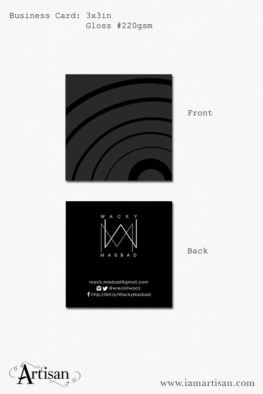 And here’s the printed social cards. We had some adjustments with the print though. I also had to erase his contact number for security purposes but feel free to follow his social media accounts.


 If you happen to meet Wacky in one of his gigs, hope you’ll like seeing his logo up in the screen.
I have few more recent branding projects that I want to share. Hopefully, I’ll find time like I always say…
If you want to work me with me with your branding or simply a logo, feel free to email me at [email protected].
