I had a privilege to design a logo for a friend, Ikei… and since this friend of mine is a business woman, I designed not only one but two logos for her. So my frustration for Illustration will be challenged again… but on the hand, these logos turned out to be one of my faves from my portfolio.
Let’s start with her catering business: Kitchen Crew. The great thing about this project was, Ikei let me decide what to do with her logo. So, I came up with a spoon and fork as her brand icon and a crooked circle that symbolized a plate. Then I just used the color palettes from her previous calling card design-apple green and shades of blue. Luckily, she loved the design as I did. It looked simple yet it implied fun and fresh.
We also printed her calling card, printed on #220gsm Matte paper. {Actual color varies from the photo}


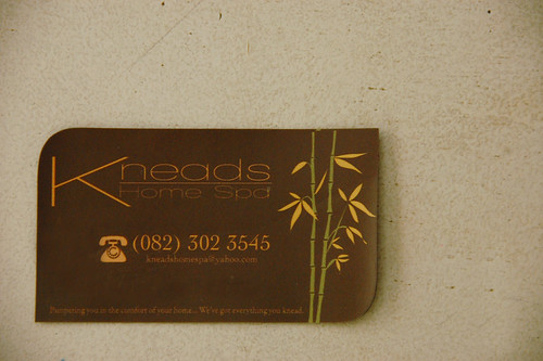
And on to the next project. A home service spa: Kneads Home Spa. This on the other hand was not as easy as the first one. We had some few logo changes but eventually we came up with the right design.
This was my first draft… we used the same apple green color, to associate with the catering. Apparently, Ikei wanted something related with a spa, like flowers, leaves, etc. {Kindly clicked on the photo for a larger view}.
Then I tried this kind of design… using leaves to incorporate with a spa. But Ikei felt there’s still something missing…
So, we changed the colors this time, and also the brand icon. I made the leaves a little curvy. Darken the green color to teal. Then showed another option for the brand icon, a bamboo…

 We were somehow close to the design with the bamboo icon, but the font needs some tweaking… and viola! We came up with the final logo and designs for her calling cards and flyers as well.


really sweet! my fave is the kitchen crew design. you are so talented my dear.
neat and clean. i like it 🙂
Thanks Ray… pwde na mag apply? hehehe
haha ako dapat mag aaply eh. you are highly qualified 🙂 ako yata ang hindi.